You can file this post more under ‘teaching ideas’ than anything particularly original. If I were to wait for something truly original to conjure itself in my head, then I would have approximately two posts over the last five years. Regardless, this is an idea still in its gestation period. Please feel free to run with it if you find it useful.
Recently, I have been exploring professionally and academically how media/primary sources/visual materials can be used as a supplemental tool for augmenting an existing learning experience. But what if this media were used to frame the learning experience rather than build upon it? What if the media itself acted as the catalyst for the conversation (rather than a facet of an answer)? What if it also happened to be metaphorical enough to be applied to abstract conceptualizations (what if it could be used as an analogy for other things)? What if it served as culturally symbolic properties? What if I stopped asking questions?
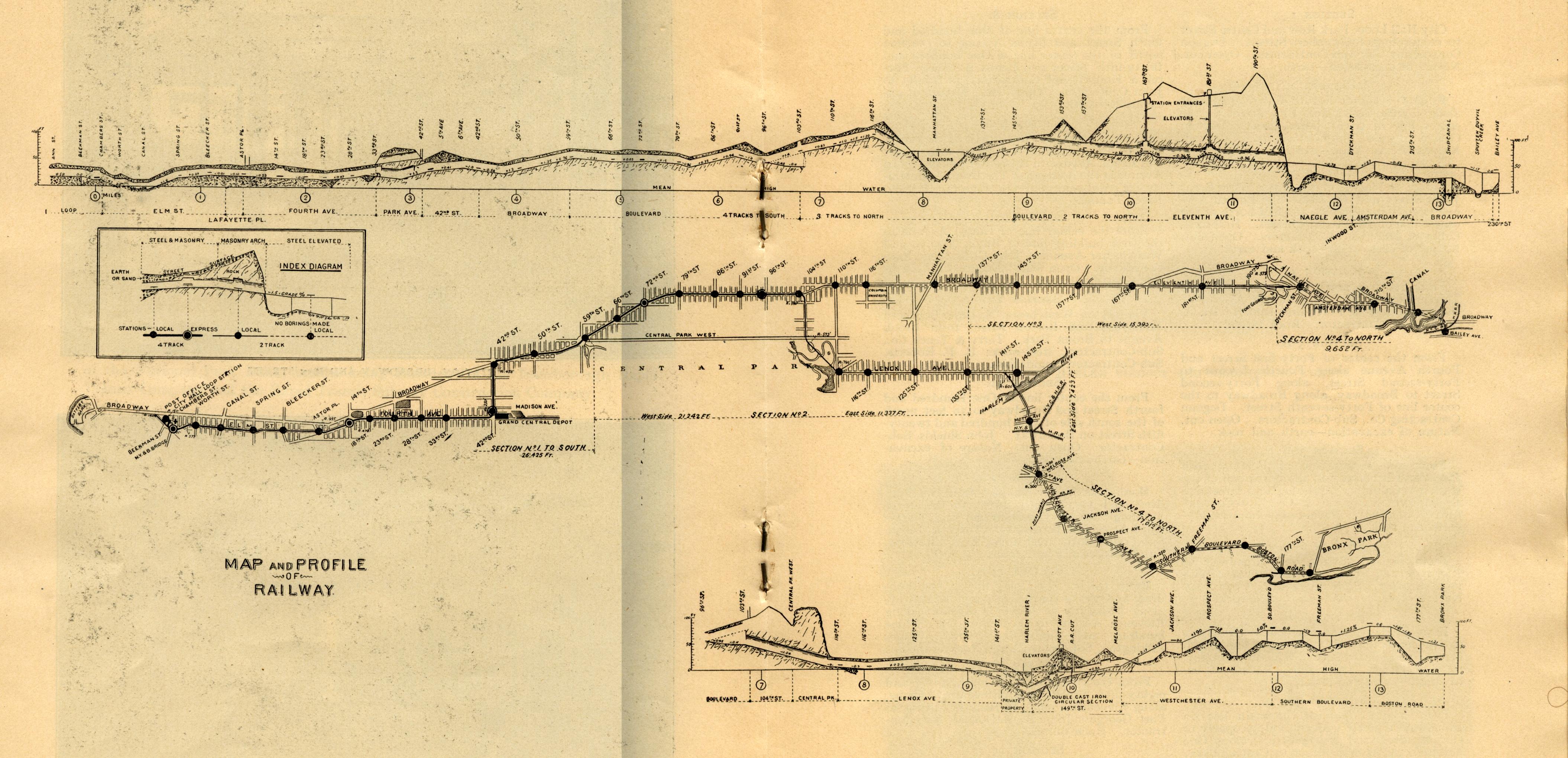
I suppose we should frame this with specifics. I am envisioning a History course as told through a fluctuating media object that has consistent points of reference. I am thinking in this instance of a subway map. Multiple iterations over segments of time. Same framework to reference progress, just a different reality.
A subway map. Just click on the image to go to this little treasure trove of a site.

What are the advantages of investigating the history of a place this way? there are several.
1. It is conceptually sound. It represents a physical construct, an obvious symbol of growth. It is the city, it is of the city, it represents the growth of the city. Good mapping from a contextualization standpoint.
2. It is multidisciplinary. Students of this time (and hopefully for all times going forward) will find advantages in thinking across the silos of academic disciplines. A subway map is an investigation of
- Economics-the greatest driver of growth. Mapping the construction of each subway line on an interactive map (which can easily be done with KML and Google Earth) will basically chart the economic growth of the city.
- Sociology-population migrations, class divides, perceived and real segregations. All would be visible depending on the priority of a subway’s expansion.
- History- each stop tells a story. Each subway stop charts the fluctuating nature of the city’s inhabitants. Harlem, for instance, tells one fascinating tale quite literally in the condensed span of a hundred years.
- Culture, Literature, Art- subway stops in popular culture. Movies, posters, poems, song, literature. These stops are iconic and they represent a greater cultural tapestry, a symbolic underpinning that we all draw from whether consciously or not.
- Science and Engineering- each iteration of the subway, from the Beach Pneumatic Transit to its current dingy manifestation tells a story of science and engineering prowess.
3. It is scaleable. The subway map basically frames the human narrative in all its disciplines, in all its anectdotal evidence, in all its successes and failures. It is the ‘hook’ that draws one into the story.

So there you have it. Media as a narrative, media as symbology, media as the gatecrasher to the exclusivity of disciplinary academia. Perhaps I should have mentioned this at the beginning of this post as some sort of disclaimer, but I absolutely adore maps. They spur the imagination like no other form of media that I know of. They challenge learners to redefine their social realities, to inherently expand them, to acknowledge a world outside their own realities.
I chose to frame this conversation through the subway of New York (primarily as a tool for teaching history), but it would work very well for those cities still technically expanding on this front (I am thinking of Seoul, Tokyo, Taipei, Beijing). For these cities, it would be a window into what they were prioritizing at the moment, where their future is headed, how they project themselves in ten years.
Ready, set, teach! Or better yet, ready, set, learn. Or better, ready, set, map!
[…] had posted before about using the New York City Subway Map as a tool for demonstrating the economic, political, and social growth of t…. Maps are learing constructs that can be employed to chart the growth of anything. In that case, […]
i like it want to know new teaching learning tools also santosh city nanded state maharashtra nation india
Hello Santosh,
Happy to give you any information I have on teaching tools. Please feel free to contact me at gallagher.michaelsean@gmail.com and we can discuss a bit.