My relationship with numbers
I should begin by saying I am not a very quantitatively-oriented person. I am not particularly good with numbers, but I do recognize their value in stimulating enthusiasm for work. I am bound by as many numbers as anyone else: my salary, my schedules, my age, cholesterol counts, my anniversary, etc. I also bind myself to numbers for the purpose of predictable output. I aim to bike at least 20 miles at least four-five times a week. I am to do certain things at certain times to condition myself to produce.
I aim to write 5000 words on any given day and 10,000 on adventurous ones. I have held myself to that writing schedule for at least the last seven or eight years. It has proven productive. But that is merely for the sake of stimulating output. It doesn’t do all that much for charting movement through research topics or interests or even for measuring impact. Impact is quite an elusive thing. How do I measure my impact on my community? Through output? That is only one side of the equation. There are many. I am not about to lend my work to some sort of reductionist tendency in our society that wants to disregard anything that cannot be overtly measured. And I agree that agendas that attempt to measure research impact need to link that to learning. No excuse not to. That is our field, our task, our whole reason to be. Learning.
But that is a community issue. On an individual level, I like to chart output as well as shifts in focus. I meander as much as the next person and am driven, obsessed almost, with not painting myself into a corner, research-wise. I like working on several projects at once and I do believe that my mind is sharper from switching between them. There is a quantitative limitation to this dabbling, however. I find 2-3 projects (along my gainful employment) to be ideal; 4 too much. So I strike a balance based on my relationship with these numbers.
I was left with the impression, however, that perhaps I had shifted far from my original research roots. Not that this movement is a bad thing; we are meant to follow paths where they or our own curiosity takes us. But as I close down the data collection for my thesis, on a subject and a locale that I doubt will intersect again this extensively in my lifetime, I find myself wanting to chart research interests over a course of time. So I started to quantify things by turning to my channel of most consistent output: this blog.
My quantified self
I have had this WordPress instance since early 2005. I used other service for a few years prior to that (although output was sporadic then). In that time, I have written over 4000 posts and have lost hundreds more in import/export foulups (on my part). Not to matter; the words are ephemeral. The conditioning is what matters. So I exported all my posts from WordPress using the basic export tool (Dahsboard>Tools). It generated a XML file which can then be used with other applications to extract frequency counts, etc.
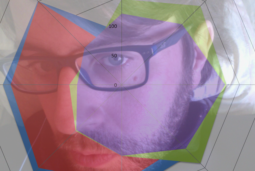
So I generated a cursory frequency count for all my posts and added in my tags, categories, and titles. I manually removed the noise (terms like Open, Post, URL, menu options, etc.) and then took the high level terms to get a sense of what I was writing most about. I broke that down by month (how many times I mentioned a specific term in a specific month). I then extracted data from the last six years on yearly intervals (January, 2008, January 2009, etc.) and then for the last full month (May, 2014). I then charted that data using a radar plot on Excel (I used to do these sorts of charts in my previous iteration in marketing). So I can see the fluctuations in the use of primary research terms over that course of time. I am only choosing the really high level stuff; the smaller ones (individual theories, locales, etc.) fluctuate rather dramatically.
I divided this into two groups of terms. One was the more obvious research topics. The other consisted of terms that may have been research topics but also provided more pragmatic information (location and technology, specifically). The one below presents the high level research terms. There is a consistent and almost all-encompassing shift from elearning and identity towards all things mobile and mlearning. This process really started accelerating in 2011-2012 as I was preparing for my doctoral study (and finishing up my Masters in Elearning (and now Digital Education) at the University of Edinburgh. Identity has more or less dropped off altogether as I find myself detaching from it a bit. It is informing my doctoral research quite a bit, but I don’t feel compelled to tackle it head-on all that often. Smarter people than myself are doing that with great consistency and insight so I will leave it to them.

The second radar plot are the second-tier categories which may or may not double as research topics as well. Africa and ICT4D ued to dominate almost all my research activity with Korea waning for years before waxing this year (not surprisingly as I am living here again). ICT4D is starting to creep back into the equation recently with a few projects I am working on, but I was sad to see its rather consistent downturn in my writing. History, despite having little to no connection to my formalized research activity, is still my topic of choice for when I read or write casually. Much of the history focus has to do with teaching things or tools that I find useful for my understanding of history.

These charts give me a sense of where I have been, research-wise, and where I am going. They also, in terms of impact, give me an idea of what I am projecting to others through my writing. Without becoming too reductionist, they are my branding and as clear an indication of what I am presenting to the world as anything I have seen. So I like to quantify and visualize this activity from time to time to remind myself of where I have been and where I am going research-wise. More importantly, these charts can remind or inform me of where I want to be and pledge myself to getting there. If something I want to do is not on this list, then I can gently remind myself that this is my responsibility as a professional to navigate my way there.
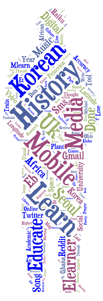
Yet, I like word clouds and all their fuzzy unscientific visualizations better. I don’t use World any longer primarily because I don’t want to have to do anything with Java, so I use alternatives. Today I found myself using Tagul, which is a perfectly good substitute. I didn’t manually remove any of the noise or highlight specific groupings of categories, but it is still a good reminder of my current focus and what I think I need to be focused on.
But much of this is just an ad-hoc vindication for what my approach has been for most of my professional life. I pursue research that I find interesting, first and foremost, and useful and occasionally novel. I let it take me where it and I both want to go, which be quite far afield from where it started. I think that is a perfectly reasonable expectation of a restless and curious mind. So my quantified self makes my qualified self content by reminding me that novelty and shifting pursuits are all perfectly complementary to impact and output. We should all have research interests that aren’t specifically tied to gainful employment as well. Hence the haiku, music, and poetry of my visualization below.
Uao Michael when I grow older I want to write like you!!!
What an incredible post is this. I admire you so much! I really think this exercise of quantifying yourself is a good one! And not being quantitative has been not a problem at all as it seems!!
There is such a fine grain work in your posts. Thank you for sharing your thoughts.