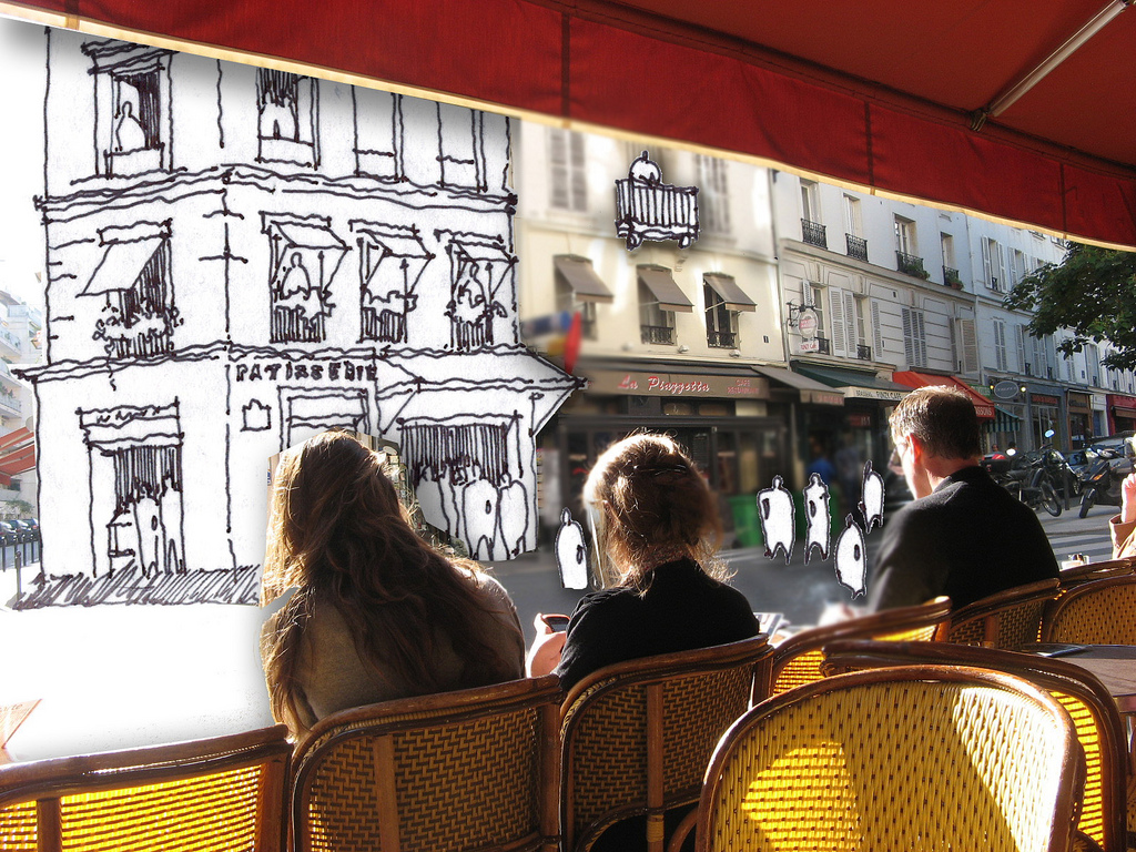
This will be a very short post, but I just wanted to show a few of the images have been providing some inspiration over the last few months as I have been putting together a book on mobile learning in the humanities. I am only using a few of these in the actual book (mostly the ones that I have taken myself); my sister has been hand drawing over them to create the initial effects you see below. All of these are first drafts and some will develop further for use in the book (mostly my own photography), but some are just because I wanted to remix a few of my favorites. They won’t appear anywhere other than here and on my Flickr page.
Some in particular are taken from the excellent Street Life in London from the London School of Economics, which I wrote about in the last post. Some are taken from Creative Commons searches on Flickr that allowed for derivative works (especially the Cornell University Library photos).
All are wonderful and all speak to the way I make meaning with historical materials. I stare at the original, am drawn to it, process it as much as I am able as it is, as the creator intended it to be. But for me to fully embed it within my own consciousness, I need to remix it somehow. I need to draw over it, discuss it, adjust the colors and hues and opacity, and reproduce it in my own way. Some archival collections don’t allow for this and I can understand the reasons why. Not being able to make derivative works does stunt learning, but I realize the need to honor the rights of the content creators. I hope to be afforded that same courtesy with my book. But remixing is what we want to do with many of these photos as all of learning is a derivative work. We assemble meaning by remixing what is there.


These are really beautiful and interesting. I love “Cutting a Sunbeam”.
Hello there, Karen! Good to hear from you again. The Cutting a Sunbeam one was quite inspirational for even writing the book in the first place although I am struggling to find permissions to use it as a derivative work so it probably won’t appear in the book. The original composition is breathtakingly rich. I enjoyed all of Adam Diston’s work: http://www.edinphoto.org.uk/4/4_eps_exhibitors_diston.htm. Great stuff. All my best!